The goal for this lesson
By the end of this lesson, you should what "responsive web design" is and why we care so much about it.
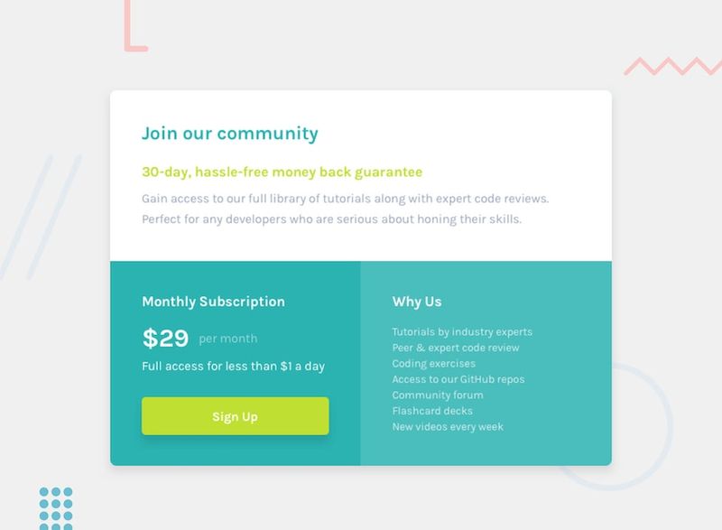
In the prior lesson, we built this pricing component with HTML and CSS:
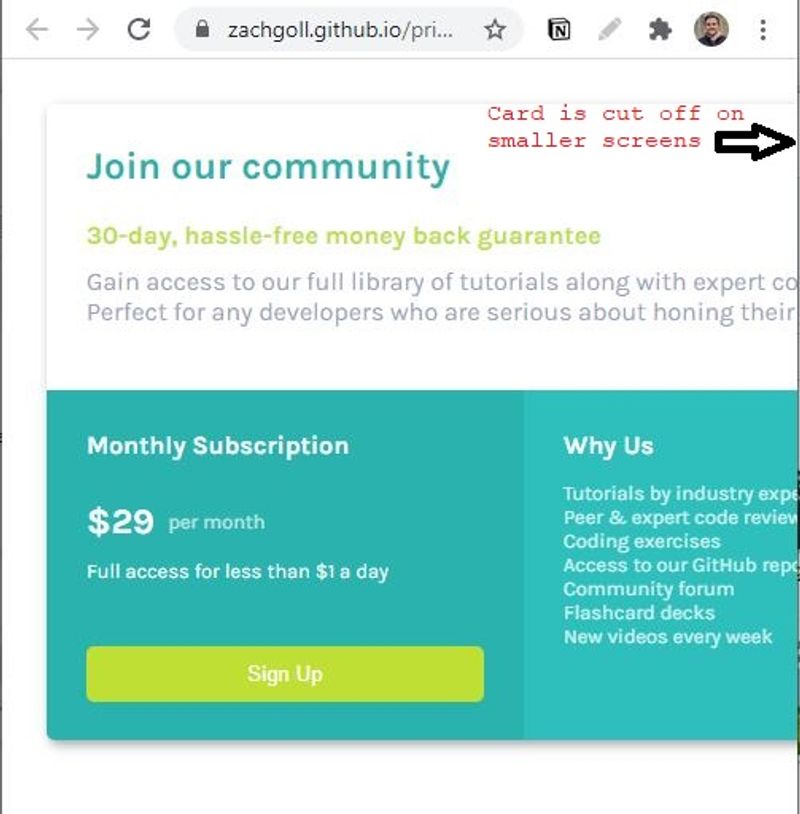
But when we resize this in the browser, it gets cut off...
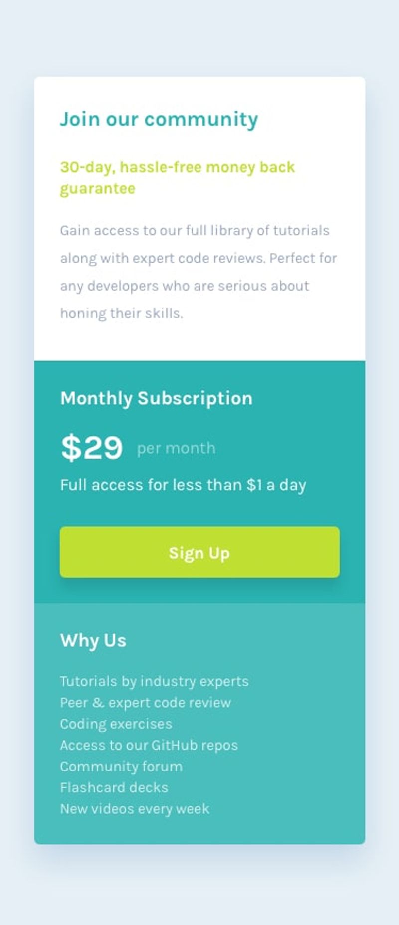
In this lesson, we're going to learn how to fix this design and make it look like this on a mobile device:
What we are covering in this lesson
- What is responsive design and why does it matter?
- Mobile-first vs. desktop-first designs
- What are CSS Breakpoints?
- A Responsive Design Checklist
What is Responsive Web Design?
We call it "responsive" design because our websites and web apps should "respond" to the user changing his/her screen size. In other words, the user should have a pleasant experience using your website on their iPhone and their massive, 2560 pixel monitor.
Maybe the best way to visualize what we mean by "responsive design" is to look at a website with poor responsive design. It's 2021, and thanks to all the website builder tools, most websites meet the minimum standards for responsive design. For that reason, I made a simple example showing what responsive design is NOT.
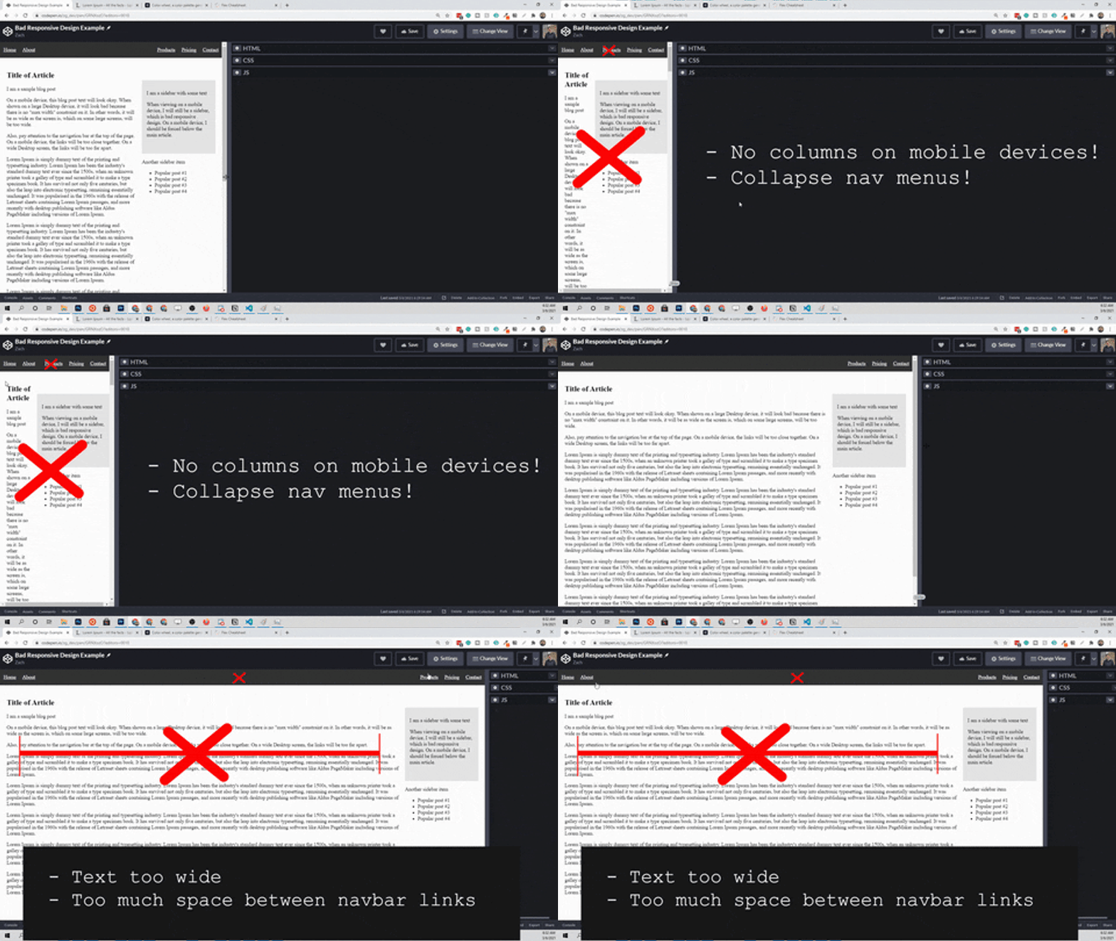
Here is the design from above, but "responsive". It is by no means the most beautiful thing in the world, but it demonstrates what "responsive design" means in a visual way.

When I first started learning to write HTML and CSS, the last thing I wanted to worry about was fitting my web app on multiple screen sizes. Writing the HTML, CSS, and JavaScript was hard enough on one device! I'm guessing you feel the same way, and for that reason, I want to start by explaining why I feel the need to include this topic in my full-stack web developer roadmap series.
You should care about responsive design because if you don't, your users will leave and probably not come back
If your users have to squint to see your website on their iPhone and can't click the links because they are so small, they will get frustrated and they will leave, no matter how good the "content/functionality" of your site is.
Okay okay, but Zach, I'm learning to code; not trying to build the perfect software product right?
I get it. Sometimes, you need to learn concepts; not waste your time fiddling around with different screen sizes for your apps. For that reason, I am going to show you the "80/20" guide to responsive design. Getting your website/app to look good on all devices shouldn't be rocket science. To help us prove this out, let's look at something called "mobile-first web design".
Mobile First vs. Desktop First
When I first heard these terms, I thought I needed to learn some entirely new framework for writing CSS.
These terms are much simpler than people make them.
When someone says that they prefer mobile-first design, they are literally telling you that they write the CSS code for a mobile device first, and then write the necessary "breakpoints" (more on this later) and CSS rules to make the same site look good on large screens.
Given the necessity of functional mobile designs in today's world, it is good to adopt a "mobile-first" mindset from the outset. Embrace it, and your users will thank you.
Design Starts without Code
Here is a concept that took me a while to internalize. Before you write a single line of code, you should have some sort of visual to look at for your mobile and desktop designs. At a minimum, you should have one of the following two things:
- Wireframes - simple sketches of your design to illustrate the layout you want
- Mockups - full designs that depict layout (how the elements are arranged) and style (colors, fonts, etc.)
A wireframe is meant to be simple. The quickest way to get started is with some good ole' pencil and paper. Here is an example:
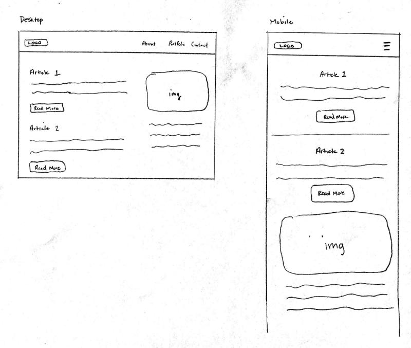
There are wireframing softwares available, but since the goal of wireframing is to get a visual idea out of your head, pencil and paper work well. If you need to design several website/app views in a much larger project, you probably need a mockup. This will be a (near) exact replica of what you want your end application to look like. While there are plenty of tool available for doing this, the easiest way to get started at the time of writing is with Figma.
If you don't have a clear visual of what you're trying to create, you won't be able to strategically write your HTML and CSS to fit that design. In other words, you'll waste a LOT of time.
But I can't design well?
That's fine. You don't have to.
I don't consider myself a terrible designer, but I've struggled a lot with it and I don't really enjoy it. The best solution in my situation is simple–hire a great designer to design all your web apps.
But finding a great designer takes time and it takes money; something that most of us don't have when we're learning to code.
Our next best option is to leverage existing designs, which is why we are using the Frontend Mentor designs in this course!
If you enjoy design and are decent at it, you might like to spend some time on this step of the process. If not, leverage existing designs as much as you can.
Can we review? What is "mobile-first" design again?
Before you write a single line of code, you need a wireframe or a mockup for both your mobile and desktop versions of the app/website. If you need both, where does the "mobile-first" part come in?
The "mobile-first" concept enters the picture when we start coding, but before we can talk about it, we need to explore something called a "CSS breakpoint".
What is a CSS Breakpoint?
So far in this series, we've left the "logic" of our webpages to JavaScript. Luckily, CSS has a few built-in ways to add logic to your designs, and one of those is breakpoints.
If I set a breakpoint at 600 pixels, what does that mean?
Well, the "viewport" of your webpage (the visible page in the browser) is always going to have a width. Remember, we can see it using JavaScript?
document.innerWidth;
And we can use it with CSS too.
.some-class {
  width: 100vw; /* 100vw is equivalent to document.innerWidth */
}
If I set a "breakpoint" at 600 pixels, I can style the elements on the page differently depending on whether the screen size is less than 600 pixels or more than 600 pixels. The following example isn't necessarily "useful", but it demonstrates this concept well. We are changing the text color based on the screen size.
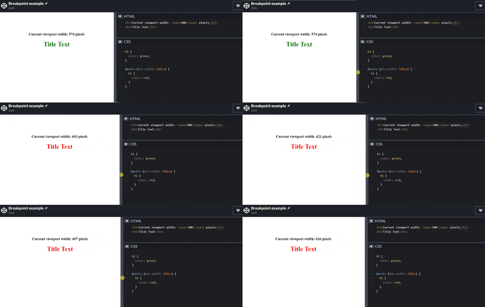
Changing the color of text isn't all that useful, but we can also change the flow of the elements on the page. This is where media queries start helping us out a lot!

From this simple example, you can imagine how helpful these breakpoints will be for us!
Choosing your Breakpoints
Remember, our goal is to design our webpages so that they are easy to interact with on ALL devices. Each device will have a different default pixel width, but here are some ranges that we can look at.
- TVs and High-Resolution Desktops - 2560 pixels
- Laptops - 1024-1440 pixels
- Tablets - 600-800 pixels
- Mobile Devices - 320-480 pixels
Please note, these are not precise ranges; they are just to give you a "ballpark" idea of what we're dealing with.
So the question becomes... If we have hundreds of different screen sizes that we have to design for, do we need hundreds of CSS breakpoints?
No!!
Each breakpoint you add to your webpage adds work to your day. Here are the questions we should be asking when determining what breakpoints to use and how many to use.
- Will this webpage be used on a mobile device often?
- Is having an intricate mobile, tablet, and desktop design critical?
- Are there breakpoint "standards" we can use?
Usually, the answer to the first question is yes unless the web app has a mobile app. For example, YouTube doesn't need to break the bank on a mobile-responsive web app because they have mobile apps on both Android and iOS. Remember, web app !== mobile app.
In our case, the answer to question #2 is no. We care mostly about learning concepts here, not optimizing a product.
The answer to question #3 is yes and no. Since there are so many different devices out there, it is hard to determine a "standard" for when your web app needs to change layouts. That said, there are several CSS frameworks out on the market that we can copy breakpoints from. We won't be diving into CSS frameworks in this full-stack series (reasoning explained in prior lesson), but here's the thing about CSS frameworks–their creators have thought about this stuff a LOT. Most CSS frameworks come with some sort of layout system, and that layout system is based on the breakpoints that they choose.
One of the most popular CSS frameworks is Boostrap, and here are their CSS breakpoints.
≥576px(sm)≥768px(m)≥992px(l)≥1200px(xl)≥1400px(xxl)
Do we have to use all six of these? No.
Our goal is to learn the basics of responsive design and focus on the code side of things, and therefore, we only need to use 1-2 of these (one design for mobile and tablet, one design for everything larger than those).
Writing Breakpoints with CSS
We have been hanging out in theory land this entire post, so let's finally write some code! Here is the basic "breakpoint" syntax.
/* On screen sizes ≥756px, apply these CSS rules */
@media (min-width: 756px) {
  /* CSS rules go here */
}
Before we go any further, let's figure out what this @media syntax means. Here is the documentation for it, but in short, this is what we call a CSS At-rule, which tells the CSS code how to behave. There are several other "At-rules", but @media is what we're interested in for now.
It is called a "media" query because this rule allows us to target different types of digital devices. Let's re-write the same rule from above four different ways.
@media all and (min-width: 756px) {
} /* Target all devices */
@media print and (min-width: 756px) {
} /* Target paged material (i.e. "print preview" mode) */
@media screen and (min-width: 756px) {
} /* Target mobile devices, tablets, computer screens (most common) */
@media speech and (min-width: 756px) {
} /* Target speech synthesizers */
The following two rules do the same thing.
@media all and (min-width: 756px) {
}
@media (min-width: 756px) {
}
So what's going on here?
CSS has logical operators just like we learned about with JavaScript. Remember this?
const myVar = 20;

if (myVar >= 10 && myVar < 100) {
  // Some code here
}
The && operator allows us to required multiple "conditions". With our @media queries, we may need to target multiple conditions. For example, we could target only "screens" that are between 400 and 600 pixels with this rule.
@media only screen and (min-width: 400px) and (max-width: 600px) {
  /* CSS rules here */
}
Furthermore, min-width and max-width are not the only arguments you can use with these rules. In the next few lessons, I am going to introduce CSS Grid and Flexbox, which are not supported yet in all browsers. We could use the @supports at-rule along with a media query to only apply certain styles to browsers that support these frameworks.
/* Only use these rules if the browser supports Flexbox */
@supports (display: flex) {
  /* CSS rules here */
}
The 80/20 Guide to Media Queries
As you can see, we're getting a little carried away here. Media queries are not just for setting breakpoints and changing CSS styles on different sized devices. We can do all sorts of interesting things with them.
But as I promised you at the beginning of this full-stack developer series, I'm going to show you what's important and what's not. And right now, this is the only syntax that is important to us.
@media (min-width: 756px) {
}
Since our goal is to learn full-stack web development (which spans a TON of topics) we don't have time to care about...
- Browser support
- Media types
- CSS logical operators
You may need these at some point, but you'll address it when you get there.
For now, I want you to learn exactly how to read this stylesheet.
html {
  box-sizing: border-box;
}

img {
  width: 100%;
}

@media (min-width: 576px) {
  img {
    width: 49%;
  }
}

@media (min-width: 992px) {
  img {
    width: 24%;
  }
}
Here is the Codepen for this to have as a reference. If you open it up, you can resize it to see how it works. A quick explanation:
- Mobile devices will display 100% width images (i.e. images vertically stacked)
- Tablet devices will display 49% width images (i.e. 2 images in each row). We can't use 50% because of whitespace. Once we learn Flexbox and CSS Grid, this won't be a problem for us anymore.
- Desktop devices will display 24% width images (i.e. 4 images in each row).
Believe it or not, what we have just written above is considered "mobile-first" CSS. Why? Because we are writing our breakpoints using the min-width property. All the "default" styles at the top will apply to mobile devices, and then subsequent rules in the media query rules will override these default styles.
Also, remember that 576px and 992px came from the Bootstrap breakpoints we talked about above.
Here's how this stylesheet is interpreted.
- Browser: "Hey CSS, here's a stylesheet with some breakpoints for you. The current screen size is 1200px. What width should the images be?"
- CSS: "Oh hey Browser. Let me read through this..."
- CSS: "First, I see an image width of 100%. Let me keep reading though in case there are rules later in the file"
- CSS: "Oh wait! I see a media query with a CSS rule on images. Is the current screen of 1200px greater than 576px? Why yes it is! Let me replace my image widths to now be 49%"
- CSS: "Okay I'm getting tired, but let me keep reading. I see one more media query. Is the current screen of 1200px greater than 992px? Yep! Let me replace my image width to now be 24%."
- CSS: "Looks like that's the end of the file. I'll keep image widths at 24%."
What if we threw a curveball and had the following stylesheet?
html {
  box-sizing: border-box;
}

img {
  width: 100%;
}

@media (min-width: 992px) {
  img {
    width: 24%;
  }
}

@media (min-width: 576px) {
  img {
    width: 49%;
  }
}
Notice how in this stylesheet, the media queries are reversed! Since the CSS document is read from top to bottom ("cascading"), the min-width: 992px media query will NEVER get applied. Since the final media query applies to all devices above 576 pixels, that will also apply to large desktop devices, and since it is last in the stylesheet, it will override the first media query! In effect, for non-mobile devices, there will be 2 images per row.
The lesson here? The order of your media queries is very important. Here are a few things to remember:
- Media queries always go at the bottom of your stylesheet
- If you have multiple
min-widthmedia queries (i.e. "mobile-first"), the largest pixel values go last. - If you have multiple
max-widthmedia queries (you usually won't because that is considered "desktop-first"), the smallest pixel values go last.
What do I put in the media query blocks?
The answer to this will become more apparent with experience. The important thing to know is that most of your CSS styles will go at the top of the file; not within media query blocks. In other words, you want to style your HTML "mobile-first" and then make small tweaks to larger designs only when necessary (via media queries).
We will be practicing this throughout the remainder of the series, so don't worry too much just yet.
"Mobile-first" Revisited
In my opinion, the reason mobile-first is a good practice to follow is for two reasons:
- HTML is naturally "responsive"
- Most people will visit your website/app on a mobile device at some point (but not vice-versa)
As you write more HTML and CSS, you will realize that without CSS, HTML shows up just fine on a mobile device. It may not look pretty, but it will have readable text and reasonably sized images.
Poor mobile experiences only happen when you start overriding HTML's natural behavior with CSS. If you design for desktop-first, there is no guarantee that your website/app will be useable on a mobile device. If you design mobile-first, your website/app will likely work just fine on larger screens without any modification.
And once again, "mobile-first" simply means writing breakpoints with min-width media queries as opposed to max-width.
Here is "mobile-first":
html {
  box-sizing: border-box;
}

img {
  width: 100%;
}

@media (min-width: 576px) {
  img {
    width: 49%;
  }
}

@media (min-width: 992px) {
  img {
    width: 24%;
  }
}
And here is "desktop-first":
html {
  box-sizing: border-box;
}

img {
  width: 24%;
}

@media (max-width: 992px) {
  img {
    width: 49%;
  }
}

@media (max-width: 576px) {
  img {
    width: 100%;
  }
}
This is a subtle difference, but an important one.
A Responsive Design Checklist
True to our "80/20" theme, here are the most important things to look for when reviewing your webpages. If you can put a check-mark by each of these, everyone will be happier.
- Fluid Layouts - Does your content rearrange itself on different devices?
- Images - Do your images maintain good aspect ratios on all devices? Are they appropriate sizes on each device?
- Text - Your text should be a "comfortable" size with "comfortable" spacing on every device. No hard and fast rules here, but generally, keep your body text around 16 pixels, and no more than 700 pixels wide on any device.
- Overflow - Nothing should overflow the screen (i.e. cut-off images or text)
- Full-width mobile content - As a general rule of thumb, don't show columns on mobile devices, and make everything 100% width of the screen.
- General Useability - Are your buttons big enough to click on a mobile device? Are the most important things showing first? I could get into a long checklist on this one, but just have a friend use your site on a mobile device and desktop device. They will quickly be able to notice anything that doesn't "feel" right.
A Quick Project
In the next two lessons of this series, we will be wrapping up our lengthy discussion on CSS with Flexbox and CSS Grid. In addition, we will be doing two projects that will combine everything we've learned.
For now, I challenge you to turn our HTML/CSS challenge from the prior lesson into a mobile-responsive webpage. In this video, we built this:

Here is the Codepen that I built it in.
When you resize the browser, this design does not "respond". I want you to refactor the code you wrote so that when looking at this on a mobile device, you see this:

Two Ways to Solve this
When we first built this, we did it "desktop-first". Because of this, the quickest and simplest way to make it "responsive" is to add CSS to the following media query:
@media (max-width: 650px) {
  /* Make it responsive with CSS here */
}
Currently, our pricing card has a width of 600 pixels, so in order to make it "responsive", we need to change its layout on devices less than 650 pixels (or somewhere around that number–it doesn't have to be exact).
Here is the solution to the "desktop-first" approach (hint: it only requires a few lines of CSS, and no changes to the HTML).
The second way of solving this is by using a "mobile-first" approach. This will take much longer and will be more challenging because you will need to completely rethink your HTML and CSS. If you go this route, I suggest the following breakpoint to stay consistent with the Bootstrap breakpoints we have been using throughout this lesson.
@media (min-width: 576px) {
}
Here is the solution using the "mobile-first" approach.
I mentioned earlier in the post that "mobile-first" designs will save you time and lines of code, but in this particular case, that was not true. Don't worry though, as your projects get larger and more complex, the "mobile-first" mindset will pay off!
